Figuring out how to make sense of your data is where the real money lies. If you’re a Salesforce user, that’s what dashboards are for. Salesforce dashboards let you take data from different reports and visualize them in different ways, so you can sort data in a way that makes the most sense for your team.
Here, I’ll walk you through how to create dashboards in Salesforce. But first, the basics.
Table of contents:
What is a Salesforce dashboard?
Salesforce dashboards let you create a visual display of data from your Salesforce reports. Each dashboard is made up of what Salesforce calls widgets—different types of charts, graphs, and tables—that allow you to get a quick overview of key metrics for your business.

There are eleven different widget types in total:
You’re able to customize each widget as well, giving it a title, subtitle, footer, and a light or dark theme.
How to build a Salesforce dashboard
I’ll guide you through creating dashboards in Salesforce using an example dashboard that shows new leads, as well as their current lead status.
-
Click the Dashboards tab.
-
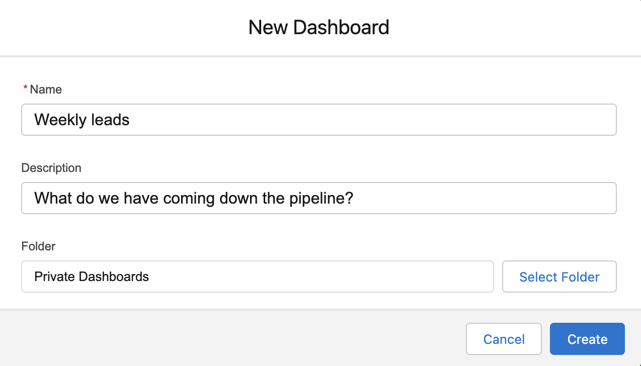
Click New Dashboard in the top-right corner.
-
Give your dashboard a name, add a description if you’d like, and choose a folder you’d like to put it in.
-
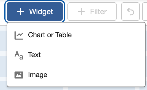
Click + Widget, and pick a format for the data: chart or table, text, or image.
-
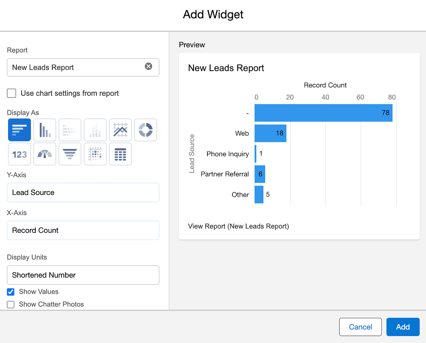
In the popup menu, choose a report that you want to pull data from. Once you’ve chosen your report, click Select.
-
Customize your widget by choosing what info you want to pull from the report, and how you want it to display. Once you’re done customizing, click Add.
-
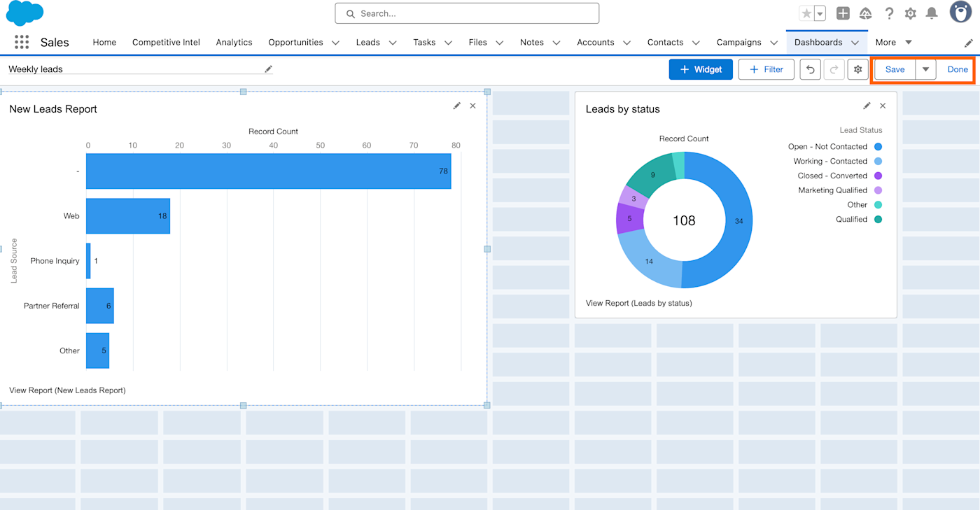
Repeat to add any other components you want in your dashboard.
-
Once you’ve added all of your components, click Save, then click Done.
-
Your dashboard is created! Review your published dashboard to make sure everything looks right.


When to create a Salesforce dashboard
Dashboards are created from data that already exists in a report, so why bother building one?
It all goes back to insights. Reports are valuable, but rows and rows of data aren’t very easy to read through—much less gain any insight from. With dashboards, you can display data from your reports in a way that’s most helpful for you.
Dashboards can even help different teams derive different insights from the same reports. For example, sales teams can use a lead report to build a sales funnel dashboard that shows them where different prospects are in the sales cycle.

At the same time, marketers can use that same lead report to create a dashboard showing how many marketing qualified leads (MQLs) they brought in, or what sources are generating the most leads.

Same report, different insights.
Automate Salesforce with Zapier
If your team lives in Salesforce, make your work life easier with Zapier’s Salesforce integration. By connecting Salesforce with thousands of other apps across your tech stack, you can streamline your entire sales process—and keep stakeholders in the loop without giving everyone login access to see your Salesforce dashboards in person. Orchestrate all your sales workflows, bring in the power of AI, and give yourself more time to focus on the human side of CRM.
Learn more about how to automate Salesforce, or get started with one of these pre-made workflows.
Zapier is the most connected AI orchestration platform—integrating with thousands of apps from partners like Google, Salesforce, and Microsoft. Use interfaces, data tables, and logic to build secure, automated, AI-powered systems for your business-critical workflows across your organization’s technology stack. Learn more.
See your data clearer with dashboards
Feeling like you’re not getting as much as you can from your data? Dashboards could be what you need to give yourself a fresh view that just might spark some of the insight you’ve been starving for.
Related reading:
This article was originally published in January 2023. The most recent update, with contributions from Nicole Replogle, was in June 2025.