I have a bad habit of screenshotting Facebook ads and sending them to friends completely unprompted. They don’t ask for ad breakdowns, but I send them anyway. Chalk it up to occupational hazard: as a marketer and consumer of ads, I can’t help but take note of ads that nail the hook, the message, and the execution.
Here, I’ve rounded up standout Facebook ad examples that do just that. I’ve grouped them into categories to make things easier to scan, but keep in mind: the best ads don’t always fit neatly into a box. Many blur the lines between formats, and that overlap is often what makes them work.
Note: Click the image of any ad for more details or to watch it in full.
Table of contents:
Facebook ad examples: Product-focused
Product-focused ads center on the product itself—what it does, how it works, and why it’s worth your attention. They typically highlight key features, benefits, or use cases, often with a quick demo or close-up visuals. The goal is clarity: show the product, show the value, and make it easy to say yes.
Canva
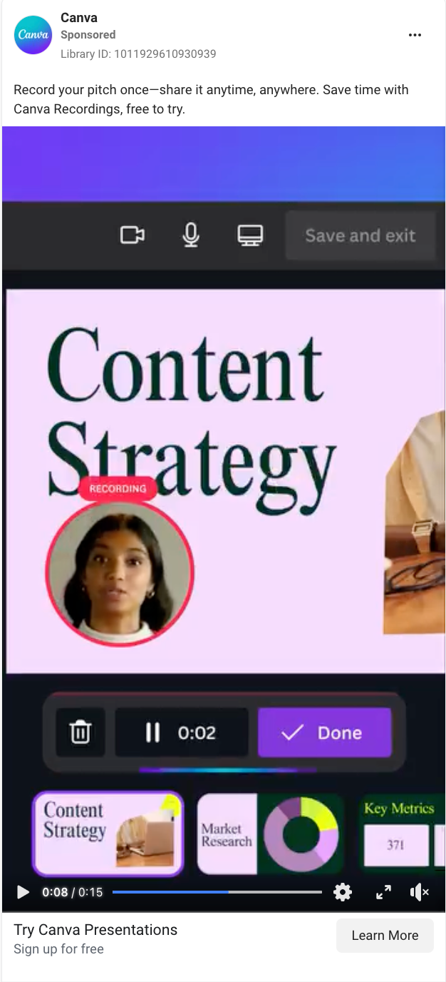
This video ad for Canva presentations shows how you can record yourself and add it to your deck with just a few clicks.
Why this Facebook ad works:
-
Feature-forward messaging: “Record your pitch once—share it anytime” in the ad copy, as well as the video itself, makes the value of Canva Recordings instantly clear.
-
In-product demo: Quick cuts through the user interface (UI) show exactly how the feature works, helping users visualize themselves using it.
-
Bright, on-brand visuals: The colorful gradient and UI overlays reinforce Canva’s identity and grab attention in the feed.
Shopify
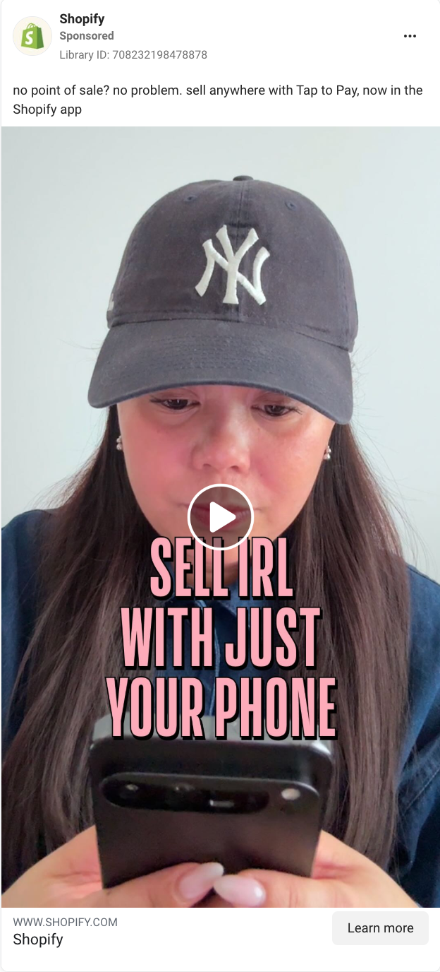
This Shopify ad features a creator who shows you how easy it is to accept in-person payments using Shopify’s tap-to-pay feature on your phone.
Why this Facebook ad works:
-
Clear value prop right away: The hook—”Sell IRL with just your phone”—immediately communicates Shopify’s benefit: You can take in-person payments without any extra hardware.
-
Visual proof of ease: The demo walks viewers through exactly how tap-to-pay works in the app, making the product feel approachable and foolproof.
-
Clever use of sound cues: Audio touches like the musical flourish on “tap to pay” and the “cha-ching” payment sound create positive emotional reinforcement for key product moments.
lululemon
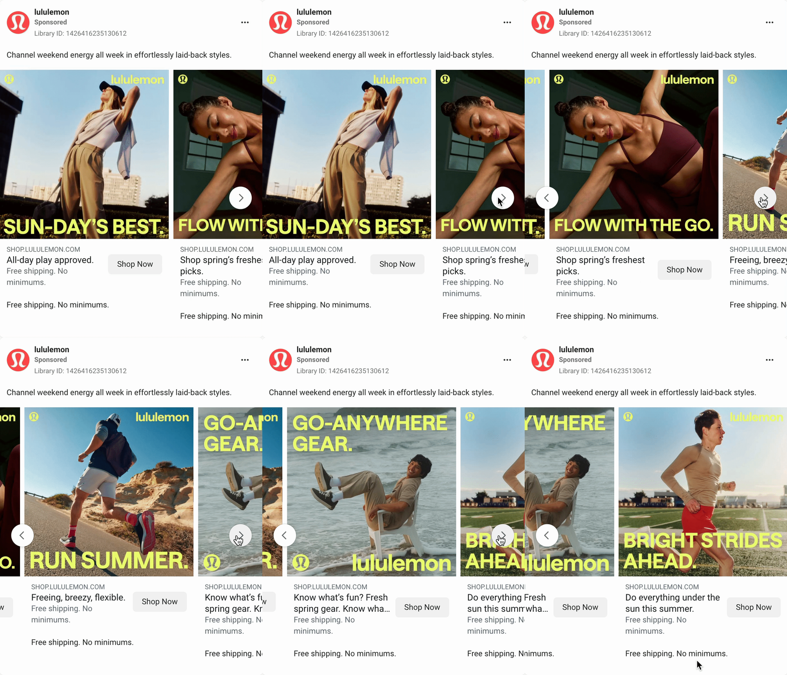
This carousel ad from lululemon highlights different pieces from their spring/summer line, with each card showing a distinct outfit and sport-specific tagline.
Why this Facebook ad works:
-
Strong visual branding: Every image in the ad carousel is vibrant, well-lit, and anchored with the lululemon logo and bold, on-brand typography.
-
Playful, sport-specific headlines: Phrases like “RUN SUMMER” and “FLOW WITH THE GO” tap into fitness culture—lululemon’s target industry—while keeping the tone fun and approachable.
-
Clear CTA: There’s a clear call-to-action: “Shop Now.” Plus, the mention of free shipping and no minimums in the ad copy helps to reduce friction.
Facebook ad examples: Educational
Education ads aim to teach the viewer something—whether it’s how a product works, why a tool matters, or what action to take next. The tone is often helpful, not salesy, and the format might include tips, quick demos, or explainer-style walkthroughs.
Zapier
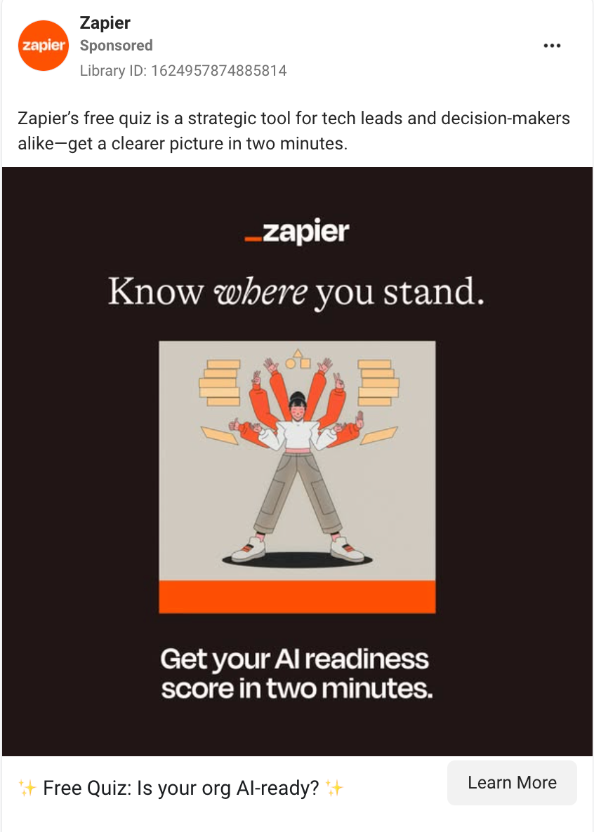
This Zapier ad promotes a free online quiz targeting tech leads and decision-makers to understand their AI readiness.
Why this Facebook ad works:
-
Clear value prop: “Get your AI readiness score in two minutes” sets expectations upfront. No vague promises—only a specific benefit for the user.
-
Ad copy speaks to a target audience: By calling out “tech leads and decision-makers” in the ad copy, this B2B Facebook ad filters exactly who it’s meant for.
-
Low barrier to entry: Positioning the offer as a “free quiz” that takes two minutes makes it sound more like a fun break than a serious task.
Jones Road Beauty
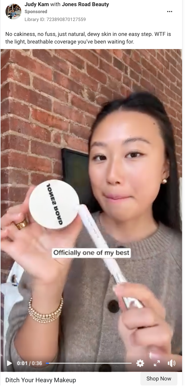
In this video ad, a creator walks through her favorite Jones Road Beauty products, demoing how she uses each one while highlighting key benefits in a casual, get-ready-with-me style.
Why this Facebook ad works:
-
Live product demo builds trust: The creator applies the makeup in real time, showing how it looks and feels on her skin, removing any guesswork for viewers considering a purchase.
-
Natural tone makes it easy to follow: Her delivery feels casual and friendly, as if you’re getting skincare advice from a friend, not a brand trying to sell you something.
-
CTA matches the message: The “Ditch Your Heavy Makeup” CTA reinforces the core benefit of the product—lightweight, natural coverage—and gives viewers a clear reason to click.
Semrush
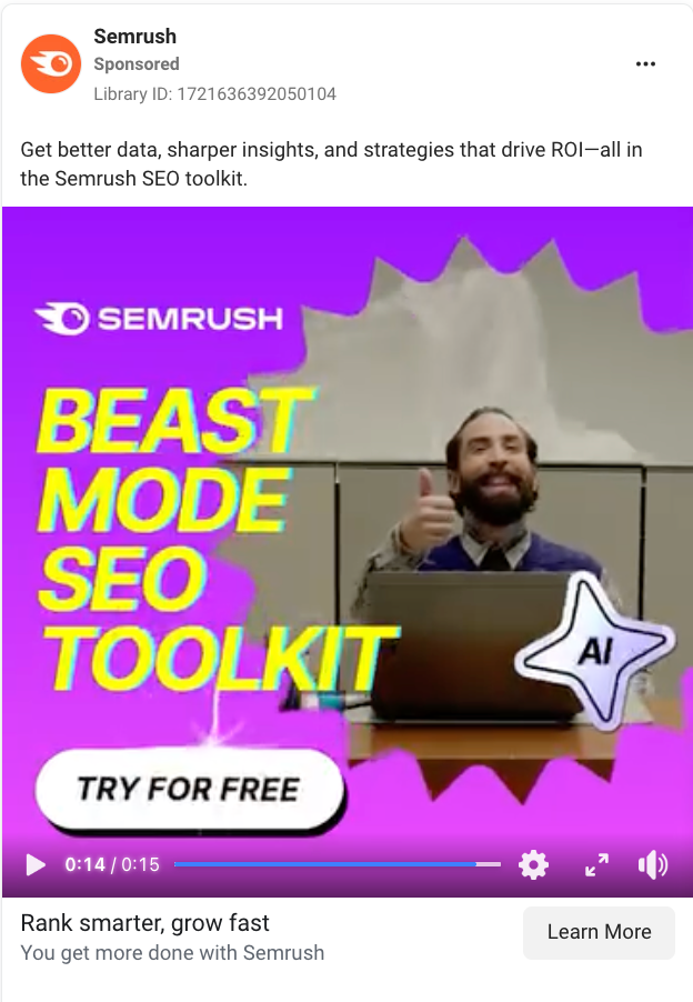
This video ad uses a playful ghost-summoning skit to encourage you to use Semrush’s SEO toolkit to do their keyword research and “summon the tools” that work for you.
Why this Facebook ad works:
-
Unexpected framing makes a boring topic memorable: By opening with a humorous “summoning spirits” gag, Semrush’s ad grabs your attention and sets a playful tone, making technical content feel approachable and fun to watch.
-
Strong contrast in visuals: The ad’s shift from moody candlelit scenes to a bright, playful UI showcase helps reinforce the before-and-after benefit of using Semrush.
-
Features the product in action: Despite the humor, the ad still clearly shows what the tool does—making it both fun and functional.
Facebook ad examples: Problem/solution
Problem/solution ads are built around a classic structure: here’s the issue you’re facing, and here’s how our product solves it. They’re effective because they make the value proposition instantly relatable. If the problem feels familiar, the solution feels necessary.
ClassPass
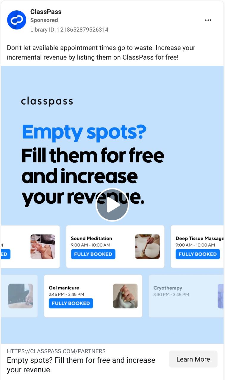
This ClassPass video ad targets service-based business owners by highlighting empty appointment slots as a core pain point, and then quickly pitches a free, low-effort solution with visuals that show those same slots fully booked.
Why this Facebook ad works:
-
Pain point right in the headline: “Empty spots?” draws in the target audience—like salons, spas, and fitness studios—by naming their problem upfront.
-
Simple, benefit-driven solution: “Fill them for free and increase your revenue” is direct and highly motivating for business owners.
-
Visual proof of results: The mock schedule shows “Fully Booked” slots, helping prospects visualize the solution in action.
Atlassian
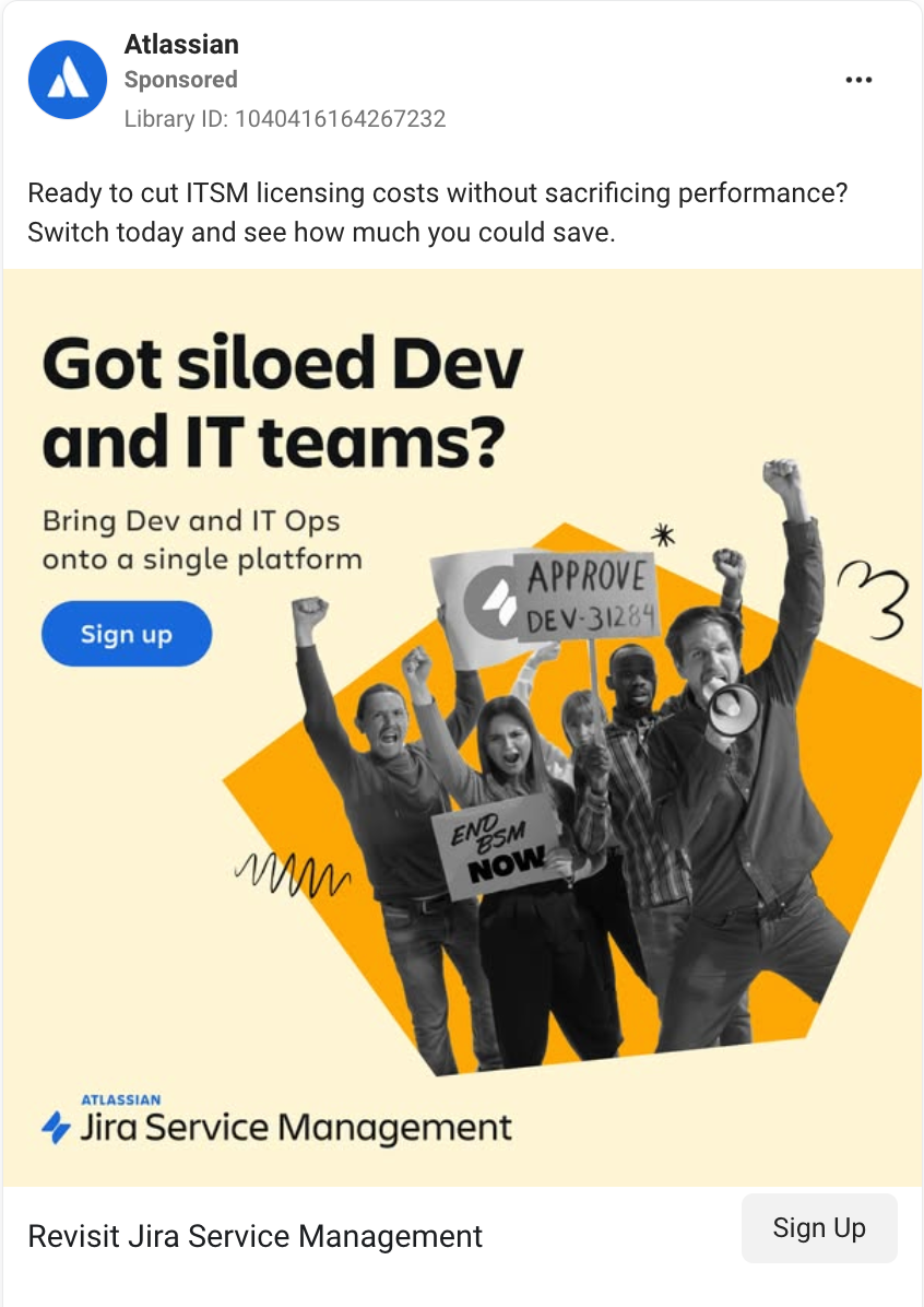
This Atlassian ad dramatizes the pain of siloed dev and IT teams with protest-style visuals, then pitches Jira Service Management as the all-in-one solution.
Why this Facebook ad works:
-
Headline highlights a relatable problem: The ad headline (“Got siloed Dev and IT teams?”) calls out a common frustration in tech orgs, communicating that Atlassian understands their target audience’s pain points.
-
Clear solution framing: The ad copy follows up with exactly what Jira Service Management (a product of Atlassian) offers: uniting Dev and IT Ops in one platform.
-
Visuals reinforce the message: The protest-style imagery uses humor and exaggeration to dramatize the pain of disconnected teams.
Expedia
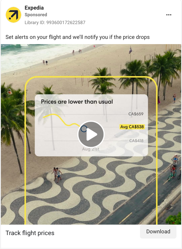
This six-second ad uses a quick, animated chart to show flight prices dropping, then jumps to a sunny vacation scene, delivering a clear message about how Expedia helps you book smarter.
Why this Facebook ad works:
-
Visualizes the solution immediately: The animated chart that shows how Expedia notifies you of lower-than-usual prices demonstrates how it helps users book smarter.
-
Ties product to real-world outcomes: Overlaying the price tracker on a beach scene, followed by vacationers enjoying that beach, makes the payoff obvious without having to overexplain it.
-
It respects the viewer’s time: In just six seconds, the ad introduces a problem, shows how Expedia solves it, and leaves you with a clear benefit. It’s quick, useful, and scroll-proof.
Facebook ad examples: Testimonials and social proof
These ads feature real people—for example, customers, founders, or experts—sharing their experience with a product. The focus is on building credibility and trust. Rather than telling you how great the product is, these ads show someone you might relate to explaining why it works for them.
Our Place
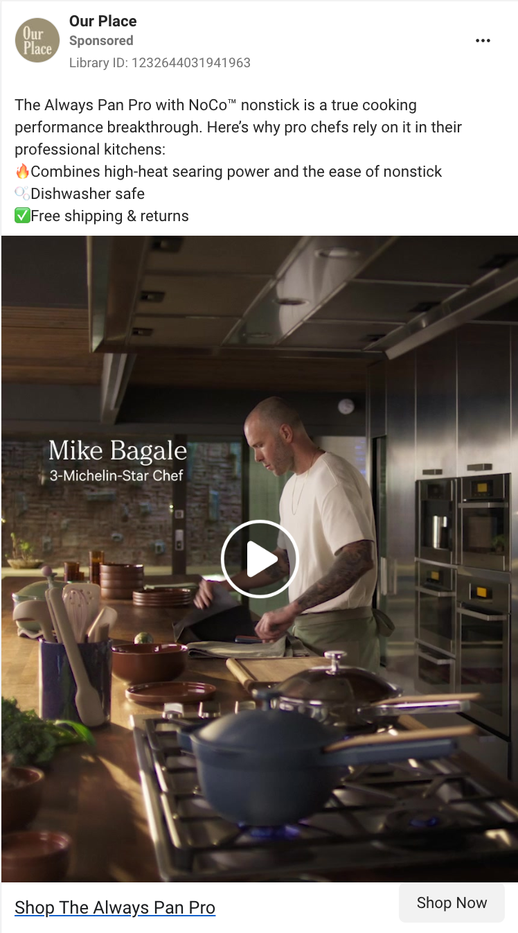
The ad features Mike Bagale, a three-Michelin-Star chef, endorsing the Always Pan Pro. He talks about the key features of the pan while simultaneously cooking delicious-looking meals using it.
Why this Facebook ad works:
-
Credible testimonial: Since Our Place sells cookware and dinnerware, featuring a Michelin Star chef to promote its latest product (a titanium-lined, non-stick pan) instantly elevates trust and perceived quality.
-
Feature highlights that speak to real use: Each feature listed in the ad copy is tied to an everyday benefit—like getting a perfect sear or skipping hand-washing.
-
Objection handling baked right in: Highlighting “free shipping and returns” in the ad copy removes a common barrier for buyers, especially for a product with a higher price point.
BambooHR
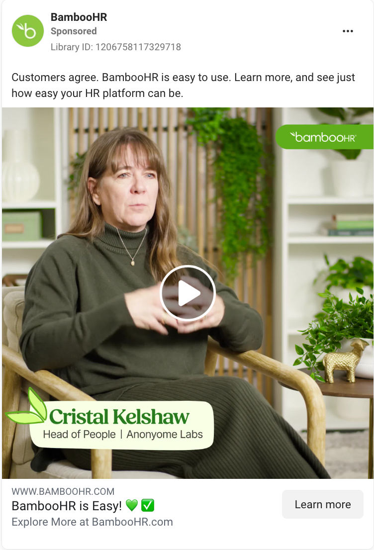
This BambooHR ad features a real customer explaining how she went from juggling spreadsheets and systems to building executive reports in under an hour with just a few clicks.
Why this Facebook ad works:
-
Relatable pain point: The customer in this testimonial shares a common pain point for HR teams, which makes it easier for prospects to see themselves in the same story.
-
Trust-building format: Instead of BambooHR bragging about itself, having a real customer speak to its benefits feels more authentic and credible, especially for B2B tools.
-
Simple language mirrors the product’s promise. The way the customer explains her BambooHR workflows—”Just click, click, click”—reflects the product’s biggest value prop: simplicity.
Navan
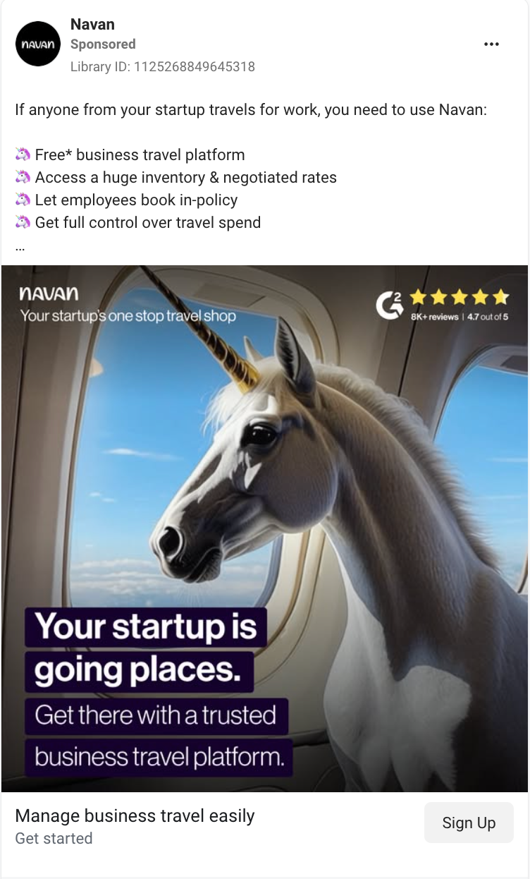
This Navan ad uses a startup-specific message, along with a strong G2 rating, to position itself as the go-to travel platform for high-growth teams.
Why this Facebook ad works:
-
It leads with social proof: A bold G2 rating (4.7/5 from 8K+ reviews) is front and center. That kind of third-party validation builds instant trust, especially in a category where trust is everything.
-
It hooks with a visual metaphor: The unicorn in a plane window is weird, memorable, and on-brand for a startup audience. It signals growth and ambition without relying on tired business stock imagery.
-
It combines value props with a punchy CTA: “Your startup is going places” is a clever double meaning, and it’s followed immediately by a clear, benefit-focused next step: “Get there with a trusted business travel platform.”
Facebook ad examples: UGC-style
UGC- (user-generated content) style ads are designed to feel like content you’d normally see in your feed, not an ad. Think unboxings, first-person narrations, or casual reviews shot on a phone. Even when they’re brand-produced, these ads borrow the tone, format, and authenticity of organic posts.
Headspace
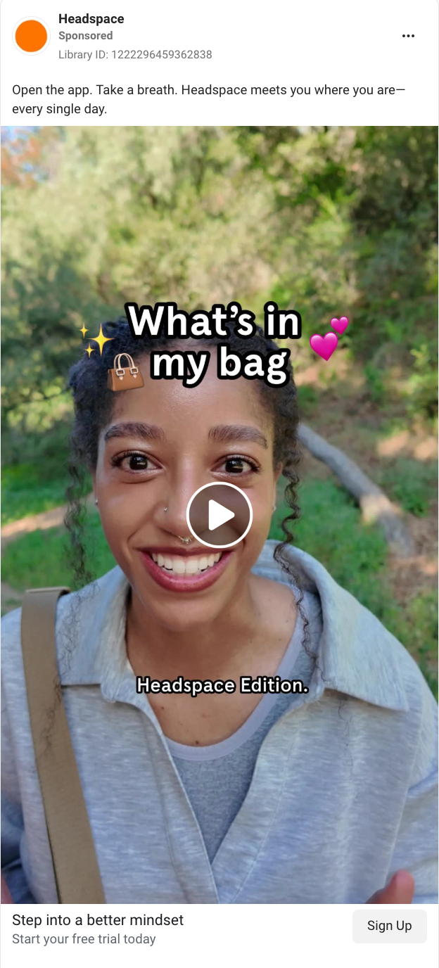
This Headspace ad features a creator who shares what she carries in her bag (spoiler alert: it’s the Headspace app) and demonstrates following a Headspace meditation on her wellness walk.
Why this Facebook ad works:
-
Native feel: The “What’s in my bag” trend immediately signals relatable, platform-native content, which is perfect for stopping someone mid-scroll.
-
Authentic tone: The close-up, first-person delivery feels personal and unscripted, which builds trust and emotional connection.
-
Soft CTA: The delivery of this ad’s CTA (“If you’re looking for a mental reset, too, check out Headspace for a free trial today”) is gentle and benefit-driven, which is in line with the brand’s voice and user expectations.
Brevitē
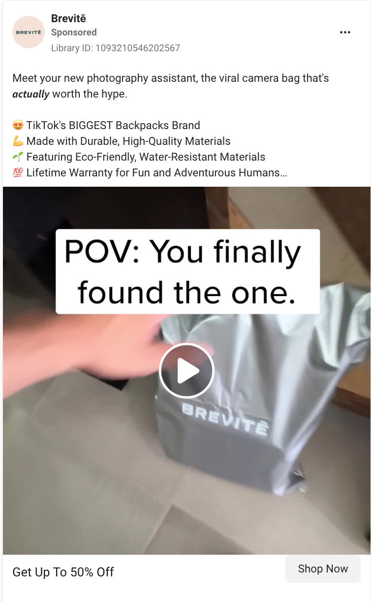
This unboxing-style video ad shows you all the key features of Brevitē’s “viral” camera bag.
Why this Facebook ad works:
-
Demonstrates the product in action: The unboxing-style video shows the backpack’s compartments and functionality, giving viewers a clear visual of what they’re buying.
-
Punchy, benefits-driven captions: Overlaid text of the backpack’s key features—for example, “Minimal outside” and “Max utility inside”—quickly highlight what makes the backpack “actually worth the hype.”
-
Visually consistent and fast-paced: The quick cuts, overhead shots, and bold text overlays match typical UGC aesthetics while keeping the focus on product features.
Adobe
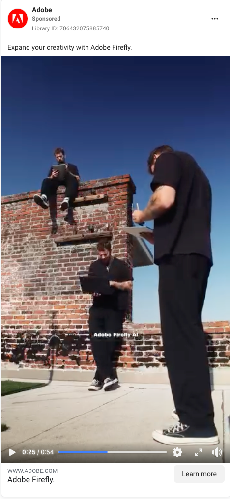
This Adobe ad follows a creator as he documents his travels through Italy, casually showcasing how he uses Adobe Firefly’s AI tools to edit his videos.
Why this Facebook ad works:
-
Creator-led and personality-driven: This ad has all the hallmarks of authentic UGC—direct-to-camera narration, casual tone, and vlog-style footage—which makes it feel less like an ad and more like organic content.
-
Natural product placement: Instead of launching into a pitch, the creator casually explains his answer to a common question he’s asked when creating travel videos: “What do you edit with?” Which makes the Adobe plug feel organic, not forced.
-
Shows the product in action: Instead of only talking about Adobe, the creator seamlessly demonstrates how he uses it—like editing himself into three spots in one scene using the enhanced Adobe Firefly AI tools.
Facebook ad examples: Storytelling
These ads use a narrative to pull you in—for example, a founder’s journey, a customer’s transformation, or a behind-the-scenes look at the creative process. The product still plays a central role, but the story is what carries the message.
Slack
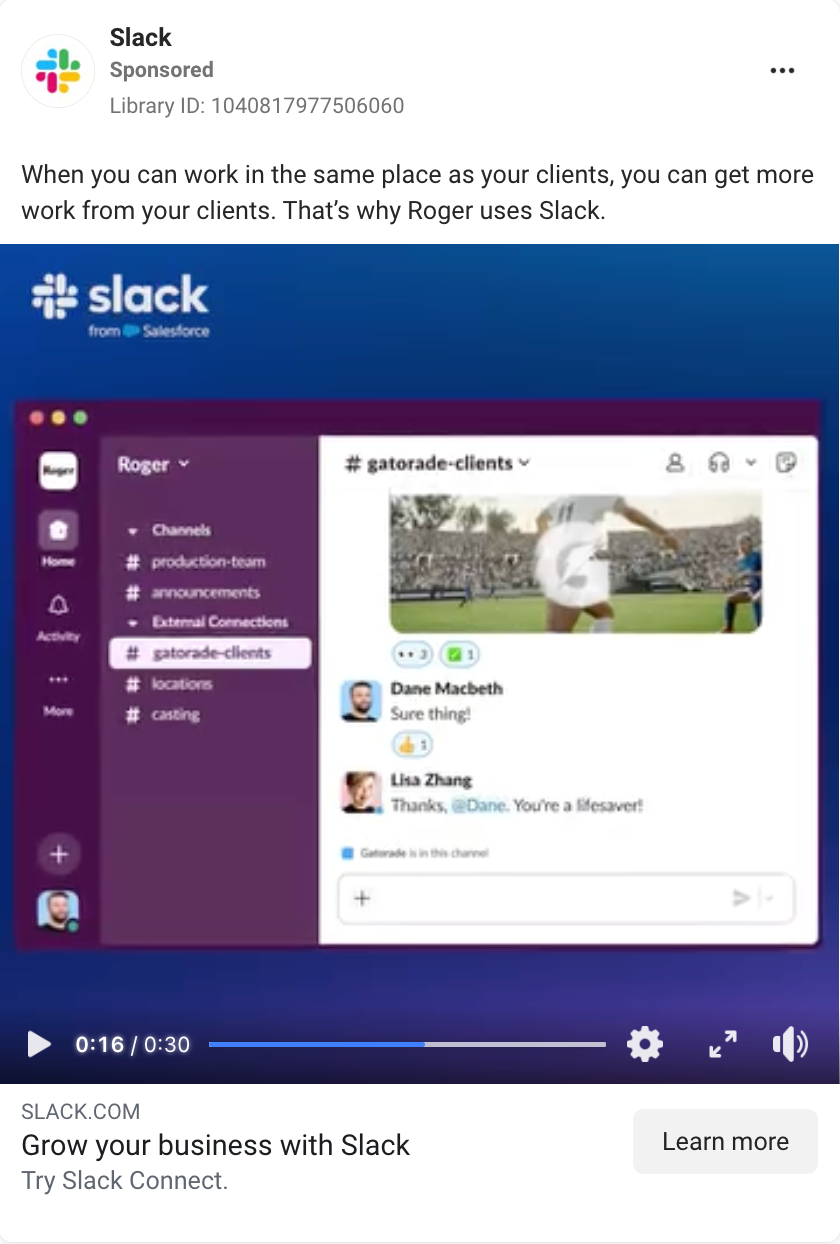
This video ad features a real customer, Dane Macbeth, sharing how his team uses Slack Connect to streamline client communication.
Why this Facebook ad works:
-
Customer-led narrative: Featuring a real Slack customer adds authenticity and makes the product benefits feel grounded and relatable.
-
Problem to outcome arc: The ad clearly sets up the challenge (slow growth and limited business) and closes the loop with a clear result: “Slack has definitely helped us grow and get more business.”
-
Real-world use case: Instead of listing features, the ad shows Slack solving a familiar small-business challenge—staying organized while scaling—making it easier for viewers to imagine how it would work for them.
Peak Design
This Peak Design ad features pro photographer Jimmy Chin using the brand’s tripod in rugged outdoor conditions while casually explaining what makes it his go-to gear.
Why this Facebook ad works:
-
It balances aspiration with approachability: Jimmy Chin, a professional photographer and Oscar-winning director, is at the top of his field. But the ad never feels out of reach. It makes you think, “If this works for him in extreme conditions, it’ll definitely hold up for me.” That’s a subtle but powerful credibility boost.
-
It shows, not tells: As Jimmy describes what his dream tripod would include, we see those features in action without needing heavy-handed explanation or branding.
-
Emotion comes through naturally: Jimmy’s closing line (“I love it—it’s sick”) isn’t polished or rehearsed, and that’s what makes it land. It feels like something he’d say off-camera, which makes it more believable than any tagline a brand could write.
Squarespace
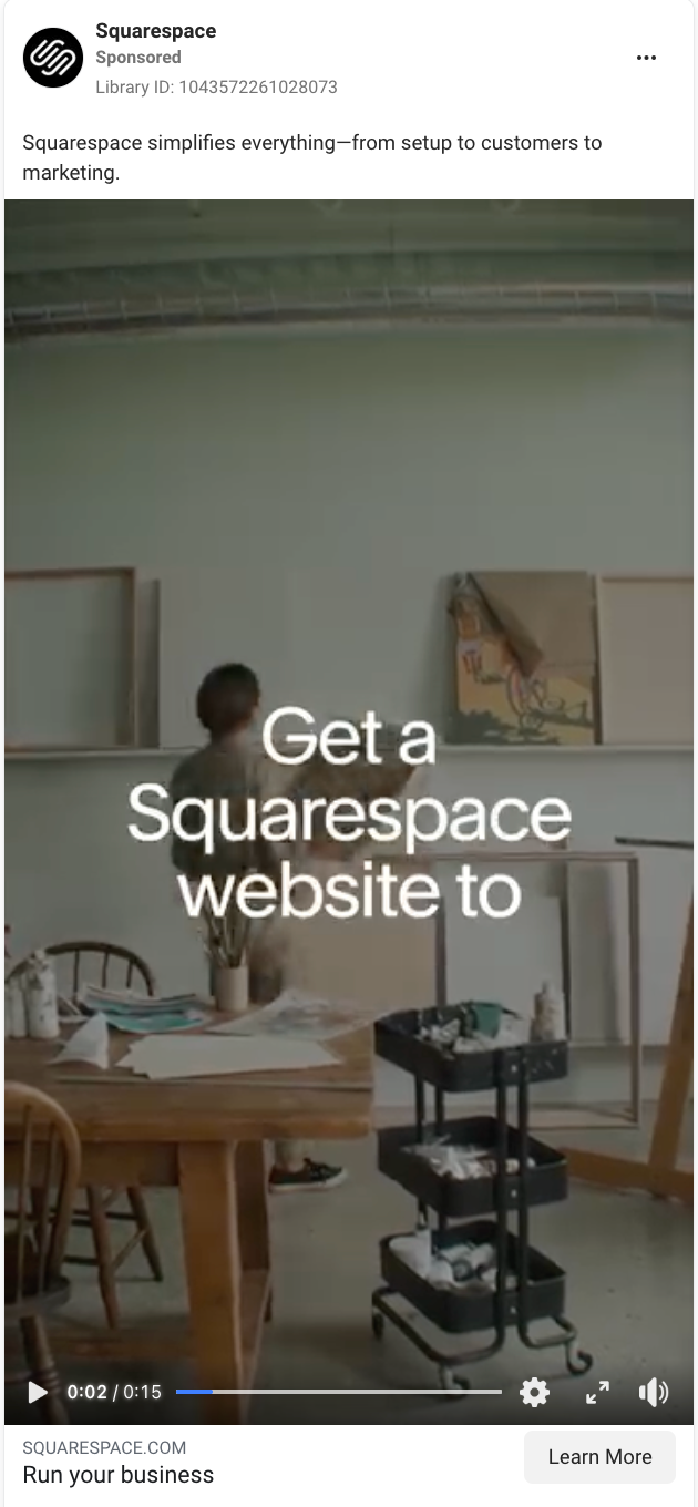
This Squarespace ad follows a business owner through a day-in-the-life workflow, showing how they use Squarespace tools to run their business—all tied together with smooth, UI-driven transitions.
Why this Facebook ad works:
-
It weaves UI into the narrative: Instead of showing disjointed product features, the ad ties them together in a day-in-the-life flow, demonstrating how its tools support every part of running a business.
-
Design matches the message: The clean transitions between the workspace and the digital dashboard reinforce what Squarespace is selling: clarity, control, and everything in one place.
-
Clear takeaway: The CTA is clear and tells the viewer exactly what to do next: “Build your business with Squarespace. Get started.”
Facebook ad examples: Trend- or moment-based
These ads tap into something timely: a cultural moment, a viral format, or a recent event. They’re meant to feel current and in the know. Whether it’s tying into an awards show, a meme, or a social media trend, the goal is to meet the audience where they are right now.
Spotify
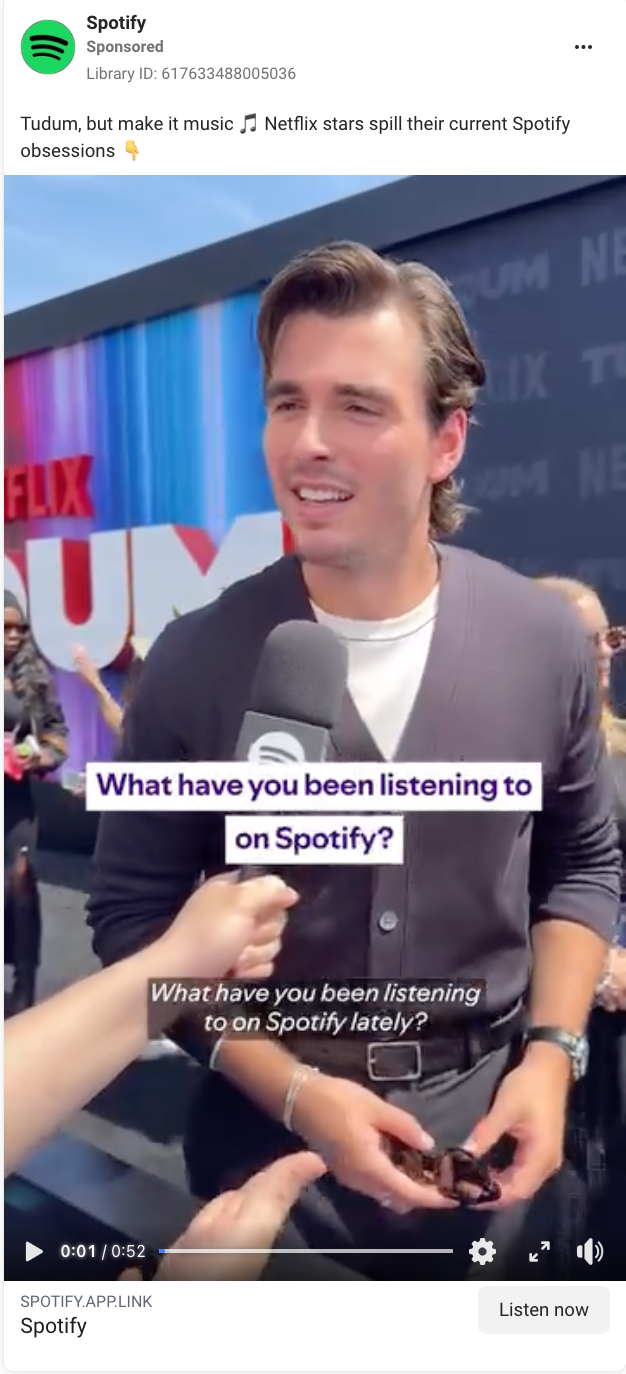
This Spotify ad captures red carpet interviews with stars at Tudum—Netflix’s own branded fan event—asking what they’re listening to on Spotify.
Why this Facebook ad works:
-
It leans into cultural relevance: Tying the ad to Tudum anchors Spotify in a moment that’s already getting buzz.
-
Familiar format: The rapid-fire Q&A on the red carpet format mimics the kind of viral content we already see on TikTok, Instagram, and YouTube. That helps the ad feel native to social and easier to engage with.
-
No product explanation needed: The product is the conversation. The celebrities are literally just using Spotify, and the viewer gets to peek into their real listening habits without giving a walkthrough of the product.
Away
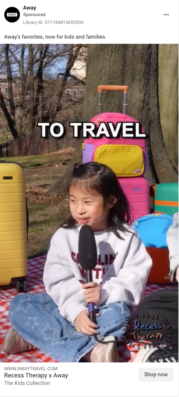
This Away ad features a Recess Therapy-style interview with a child sharing why she loves to travel, set against the backdrop of Away’s new luggage collection for kids.
Why this Facebook ad works:
-
Taps into a current win: By featuring a Webby-winning series while it’s still fresh in viewers’ minds, Away gets to share in that cultural spotlight without having to manufacture its own hype.
-
It borrows from a beloved format: Recess Therapy’s viral interview style is instantly recognizable and already has built-in trust and appeal. It makes the ad feel more like internet fun than a brand spot.
-
Product placement is subtle but steady: Away’s new collection of kids luggage stays in frame, reinforcing the brand without stealing the spotlight from the interview.
Hootsuite
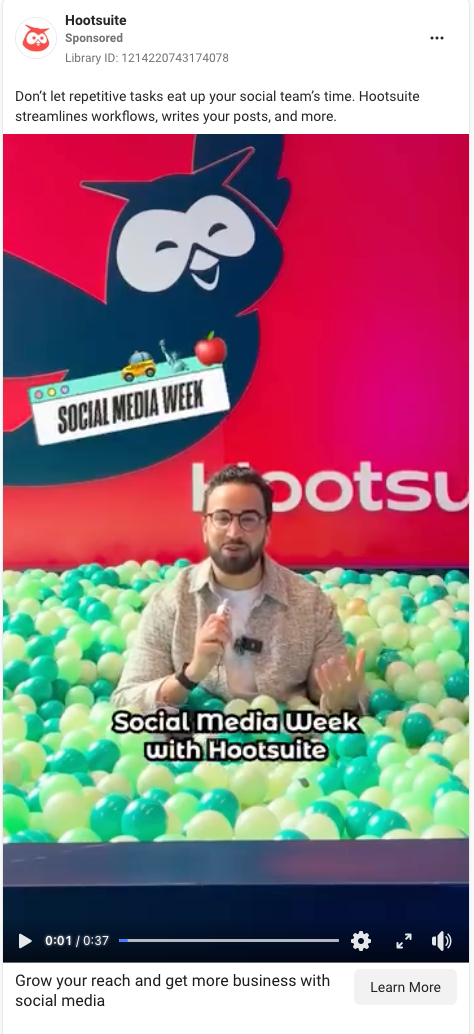
This ad, filmed at Social Media Week, features social media marketers answering trend-focused questions that were pulled using Hootsuite Listening.
Why this Facebook ad works:
-
It leans into a timely event: By filming at Social Media Week, Hootsuite rides the wave of a relevant industry moment, boosting engagement from viewers who want in on the latest buzz.
-
Ball pit setting keeps it playful: The setup is unexpected but on-brand for social media pros. It grabs attention and adds a little levity to a B2B message.
-
It blends real reactions with product messaging: Marketers give genuine responses to trending topics while the host weaves in how Hootsuite Listening powers those insights, creating a natural connection to the product.
Automate your Facebook ad workflows
Creating standout Facebook ads takes time: writing, designing, filming—it all adds up. And that doesn’t leave much bandwidth for the behind-the-scenes work that actually gets your ads in front of your target audience.
With Zapier, you can integrate Facebook’s suite of apps, including Facebook Lead Ads, Facebook Pages, Facebook Custom Audiences, Facebook Conversions, and Facebook Messenger, with thousands of other apps. This way, you can orchestrate a fully automated lead management system that alerts you about new leads, adds them to your CRM, and responds to customers wherever they are.
Learn more in Zapier’s guide to Facebook automation, or get started with one of these pre-made workflows.
Zapier is the most connected AI orchestration platform—integrating with thousands of apps from partners like Google, Salesforce, and Microsoft. Use interfaces, data tables, and logic to build secure, automated, AI-powered systems for your business-critical workflows across your organization’s technology stack. Learn more.
Related reading:
This article was originally published in November 2021 with contributions from Ana Gotter and Melissa King. The most recent update was in June 2025.
